Independent fictional brand · Digital storefront
Fruloom Ice CandyA little fruit.
A lot of possibility.
An independent fictional ice-candy brand, connecting playful product storytelling with a clear path to the basket.
Explore the live concept01 / The opportunity
Let the product do the talking.
The earlier concept leaned on comic panels, heavy frames and repeated messages. My visual review pointed to a simpler direction: bring the ice candy forward, show the four flavours clearly and make the next action easy to find.
The design challenge was to keep the playful identity while giving the shopping journey a clear structure.
Product first
A recognisable ice candy, before a long brand story.
Choice in reach
Labelled flavours and a consistent basket action.
Motion with a purpose
Let people explore or go straight to their choice.
02 / Design decisions
One product. A clear way to choose.
The flavour stage separates three jobs: choose a flavour, recognise the product and continue to the basket. These annotations follow the actual Passion fruit screen.
- 01 · Choose directly. Four labelled tabs sit above the product stage, with the selected flavour underlined.
- 02 · Recognise the flavour. The large name sits left of the product; the imagery and palette change with the selection.
- 03 · Continue in place. Description, sample price and Add to Basket stay together on the right.
03 / Low to high fidelity
From structure to the same working screen.
The homepage introduces the product with one discovery action. The separate flavour stage adds direct tabs, a price and a basket action. Each reconstruction below keeps the layout of the real screen alongside it.
01 / Homepage
02 / Passion fruit stage
Screen-matched reconstructions made for this case study. Product art is represented by simple shapes; navigation and action placement follow the live interface.
04 / The homepage
An invitation to discover a flavour.
The opening uses one product, a short headline and one primary action. Generous space gives the imagery room to work. The fruit story and wider range follow after the visitor knows what Fruloom offers.
The decision: let imagery create the atmosphere, and let the labels explain what to do.
05 / Flavour discovery
Expressive to explore.
Direct to choose.
Mango, coconut, jackfruit and passion fruit share the same layout. The product, palette and description change together. Scrolling moves through the flavours where the stage fits; tabs offer a direct route on every screen.
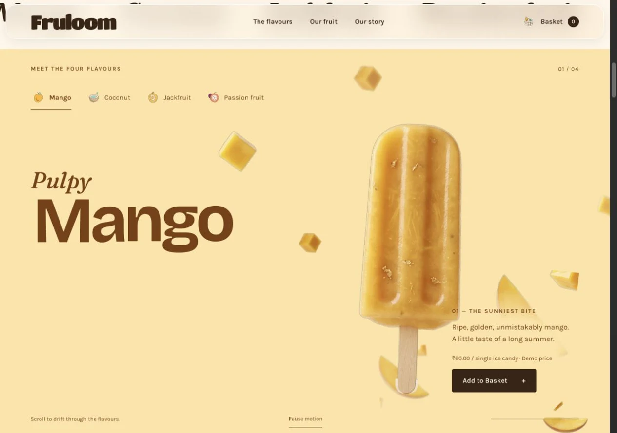
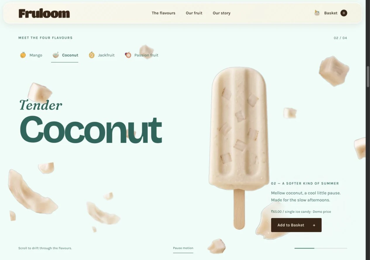
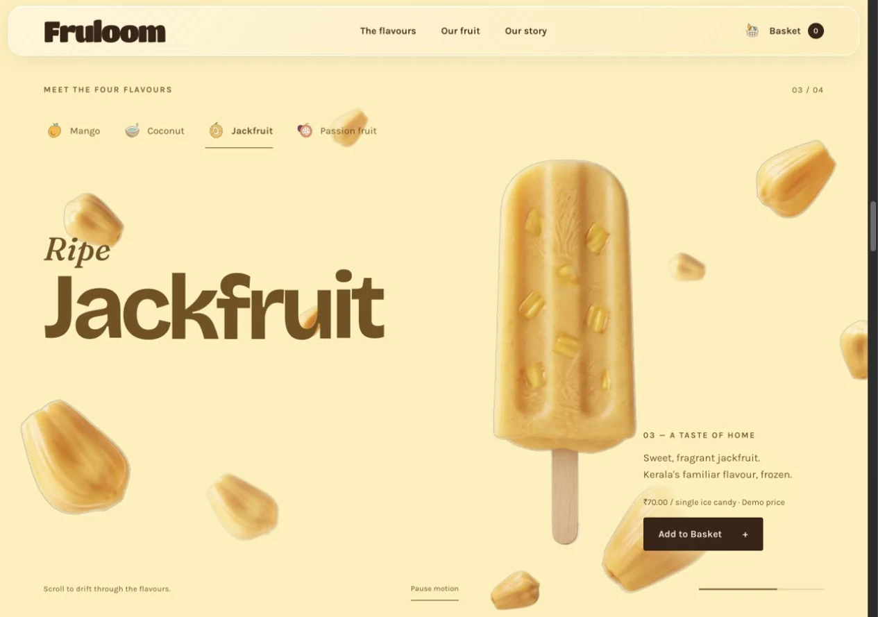
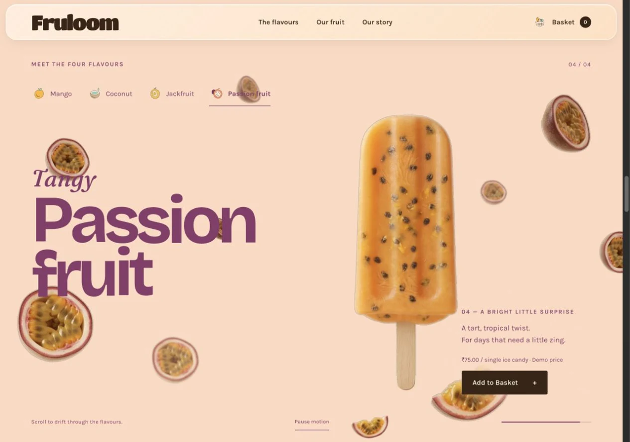
Mango · Product, description, sample price and basket action in one view.
Interactive screen walkthrough · Real captures from the live concept. Choose a step or press Play.
Try the working prototype.
Explore the flavours and the demo basket here.
A shorter route on a smaller screen.
The compact stage supports scrolling and direct flavour tabs. Pause motion and reduced-motion support keep the choices available when the animation is paused or reduced.
06 / A connected identity
One flavour language, beyond the screen.
Fruit imagery and flavour colours carry into the orchard index and packaging concepts. The orchard preview changes in place, keeping people within the product story.
07 / The shopping flow
Keep the next step visible.
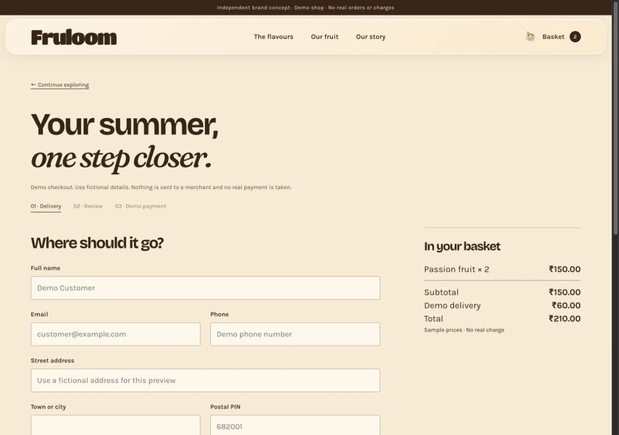
The basket stays close to the product. People can adjust quantities, remove an item and inspect the total before moving into the demo checkout. Delivery and review steps make the sequence explicit.
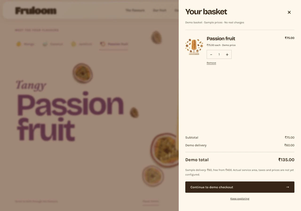
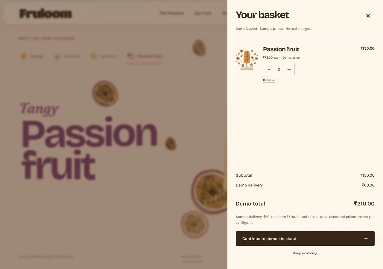
Add an item · The basket opens with a clear quantity and total.
Screen walkthrough · Passion fruit goes from one to two items, then into checkout with the same ₹210 total. Sample prices and simulated payment; no real order or charge.
The interaction principle: acknowledge an action where it happens, then show a clear way forward.
08 / Outcome & reflection
A connected concept, ready for the next test.
The result is a responsive website joining product identity, flavour discovery and a demo shopping flow. The strongest learning was that expressive motion needs an equally clear direct route.
Flavour journeys
One consistent interaction pattern.
Ways to explore
Scroll-led discovery and direct tabs.
Connected flow
Product, basket and demo checkout.
These describe the delivered concept. Customer task success, conversion and sales have not been measured.
What was checked, and what remains
Build checks covered desktop and mobile layouts, flavour controls, motion controls, orchard previews, basket quantities and simulated checkout recovery. Those checks do not establish customer usability. A screen-reader audit and testing with potential customers remain next steps.
09 / Next phase
Move from a working concept to evidence.
The next phase would test the choices behind the interface before extending the experience.
Good motion adds character.
Good structure makes it useful.